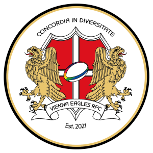
In designing our team’s crest, it was important to us to visibly incorporate the following three elements
To establish the reference to the history of early rugby clubs we looked at English clubs from the 1910s and 20s and incorporated some of the stylistic elements.
The reference to the city of Vienna is established on the one hand with the white cross on a red background reminiscent of the city’s flag and on the other hand with the two eagles and the unique typeface, which are inspired by the Art Nouveau period with a focus on the work of Otto Wagner.
The Rugby ball presented in rainbow colours at the centre of the crest is a reference to our firm commitment to diversity within the team. Our slogan “concordia in diversitate” – unity in diversity – builds a bridge between the two eagles. It is our guiding principle.